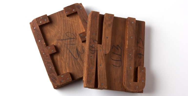
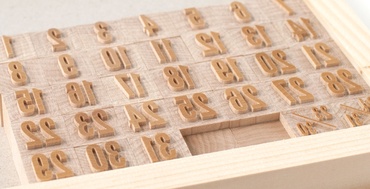
For over a year James Grieshaber has been working on an inventory of all the old patterns that were aquired from American Wood Type. One of the patterns ...
Color. read more
Tags:
ampersand,
chromatic,
circus type,
letterpress,
William H Page,
wood,
wood type,
wooden type,
type,
typeface,
josef albers,
color theory,
overprint,
printing ink,
0 comments
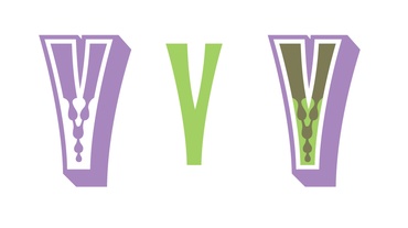
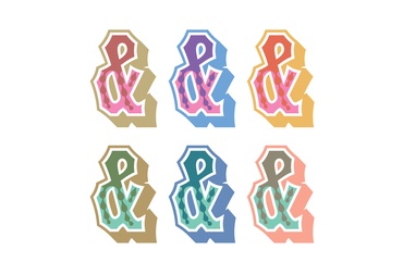
In the middle of the American Victorian era (1860s–1870s) a new method of introducing a splash of color to letterpress printing was invented by William H. Page in Connecticut. Chromatic wood type allowed for a circus-like color effect to dance across the printed page. Through the passage of time and ... read more
Tags:
chromatic,
circus type,
William H Page,
wood type,
letterpress,
printing,
type,
wooden type,
wood,
0 comments
Virgin Wood Type made the trip from HQ in Rochester, New York, for the Wayzgoose at the Hamilton Wood Type and Printing Museum in Two Rivers, Wisconsin. To break up the drive, on Thursday the VWT Prius stopped in Chicago long enough for us to visit the studio of Starshaped ... read more
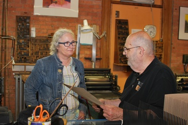
In August of this year, Frank Romano stopped by the Virgin Wood Type shop because he was surprised to learn about the revival of wood type manufacturing. Romano is world-famous in the printing and publishing industries for his vast knowledge, unmatched ability to talk about both in a way that ... read more
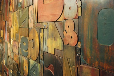
Being in the business of manufacturing wood type, one must always be on the lookout for a font that would be cool in wood. When Bill and Geri bought the assets of American Wood Type in the fall of 2009, they bought the rights to many classics, Shadow, Gill Sans, ... read more
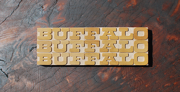
This whole social media thing might take off. While visiting family in southeast Ohio, I posted to my personal Instagram account a photo of the word “OHIO” printed over a faux wood grain on a cigar box. Out of nowhere came an invitation in my Instagram comments to visit the ... read more
Tags:
wood type,
type,
letterpress,
paper making,
font,
cleveland,
2 comments
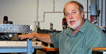
On a recent sleepy, summer Sunday, my wife and I visited with Scott Moore of Moore Wood Type in Columbus, Ohio. It was only fitting that I needed to take the Hamilton Road exit on the freeway to get to Scott’s house. Scott became a student of all things Hamilton ... read more
Tags:
wood,
wood type,
moore wood type,
scott moore,
erin beckloff,
hamilton wood type and printing museum,
matt rieck,
0 comments
The marking of days in some form goes back millennia. Anthropologists have uncovered remains of ancient calendars all over the world. Famous American sci-fi TV series, “Star Trek,” employed a fictional system of measuring days called “Stardate.” read more
Tags:
calendar font,
wood type,
letterpress,
gothic,
calendar,
0 comments
We’re celebrating our one-year anniversary of re-launching Virgin Wood Type this month, and we’ve learned a lot to improve our products. read more
Tags:
wood,
wood type,
printing,
letterpress,
product line,
type,
font,
0 comments
Last week we proudly launched wood type streamers, which is a collaboration with David Wolske. Starting in July 2010, before Virgin Wood Type (VWT) was born, Bill Jones had established an email friendship with David because of David’s Letterpress Daily blog. The two exchanged email about wood type, typography, and ... read more
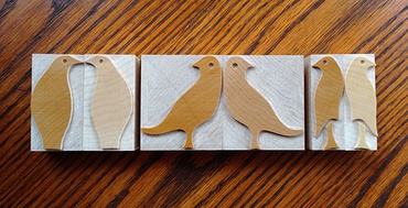
No, this blog entry will not be about Alfred Hitchcock’s 1963 horror film masterpiece. In the film, the birds were menacing and murderous. That’s not our way here at Virgin Wood Type. read more
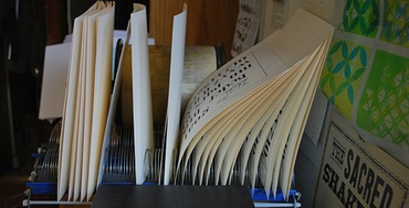
Last weekend Geri Instagrammed a photo of the drying rack at the Printing and Book Arts Center at the Genesee Center for the Arts and Education (that's a mouthful). Reaction was over the moon! I think the outpouring of love was based on the simple fact that the heart of ... read more